


Robert Halloway, Senior Health and Science Editor.
Most of us own a drawer we do not open in front of guests: eight, ten, maybe fourteen eyeshadow palettes, half of them touched twice. The colour looked right in the store. At home, under the bathroom light, it went patchy, or muddy, or simply refused to show up at all. The question a reader eventually types into a search bar is not “which palette is best.” It is closer to “why does this keep happening to me.”
The honest answer has less to do with luck than with reading a pan the way a formulator would, before it ever reaches your eyelid. A single swatch, done properly, tells you almost everything: whether the colour is built on real pigment or mostly filler, whether it will blend or fight you, whether it will still be there at six in the evening. This guide walks through what that swatch, and a few other quick checks, are actually telling you.
- One swipe, two passes: dragging a finger across a shade twice, not once, separates a well-pigmented formula from one leaning on filler to look bold in the pan.
- Daylight overrules store light: fluorescent lighting shifts almost every shade warmer, so a colour that looked neutral at the counter can read orange or grey at home.
- Fallout is a formula tell, not bad luck: powder that sheds onto the cheek within seconds usually means a looser pigment-to-binder ratio, not a one-off bad batch.
Reading Pigment Payoff Without Buying Anything
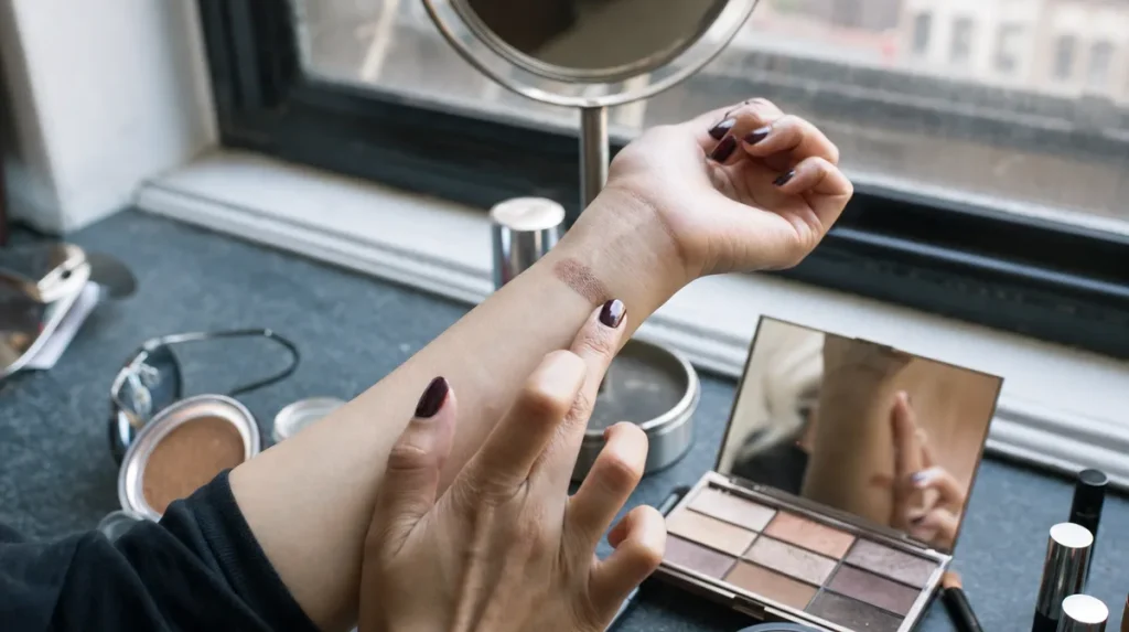
Every eyeshadow pan is a mix of pigment, binder, and filler, pressed together under heat. Pigment is the expensive part. Filler, usually talc or mica base, bulks the formula out cheaply. A shade with plenty of pigment shows colour on the first light touch. A shade leaning on filler needs several passes before it looks like anything.
Think of it the way a painter thinks of watered-down paint: the colour is technically there, but you need three coats to get what one coat of the good stuff would give you.
The test costs nothing and takes ten seconds at any counter. Swipe a finger once across the pan and look at the back of your hand. Swipe again in the same spot. If the second pass looks dramatically stronger than the first, the formula is thin on pigment and thick on filler. A well-built shade shows most of its colour on that first pass.
Testing Blendability At The Counter
Blending is really a friction problem. A shadow with fine, evenly milled particles moves under a brush the way soft butter spreads on warm bread. A shadow milled unevenly, or pressed too hard into the pan, behaves like cold butter: it drags, it streaks, it sits in one place until you have worked it far longer than you should need to.
You do not need your own brush to check this. Most counters have a clean applicator or a cotton swab on hand. Pick up a small amount and drag it across the back of your hand in one direction, then try to soften the edge with a second, lighter stroke. A shade that blends well will feather at the edge on that second stroke. One that does not will leave a hard line no matter how many times you go back over it.
A 2021 study in the International Journal of Cosmetic Science measured particle size distribution across several pressed-powder eyeshadow formulas and found that finer, more uniform particle sizes correlated with lower drag and easier edge diffusion during application, which matches what most people feel with their fingertip long before they read a lab report.
Finding Your Undertone In Daylight, Not Under Store Lighting
Cosmetics counters are lit to flatter. Warm-toned fluorescent and LED lighting, common in department stores, pushes every colour a step warmer than it actually is. A taupe that looked soft and neutral at the counter can read distinctly orange once you step outside, or distinctly grey under a bathroom’s cooler bulb.
The fix is simple but easy to skip when you are in a hurry. Swatch the shade, then physically walk it to a window or, better, outside for a few seconds before deciding. If a store does not allow that, hold the swatch against a plain white surface, like a receipt or a tissue, which cancels out some of the coloured light bouncing around the space.
The common mistake is buying under one light and wearing under another and blaming the palette. The palette usually has not changed. The light has.
Judging Texture: Fallout Versus Cohesion
Fallout, the fine powder that drifts down onto the cheek during application, is not simply messiness. It is a direct readout of how tightly a formula’s pigment binds to itself and to the pan. A cohesive pressed powder holds together as a small chunk when you press a fingertip into it and lift away. A loose, chalky one crumbles.
The difference comes down to how much binding agent, usually a blend of oils or waxes, the manufacturer used relative to pigment and filler. Too little binder and the powder never fully compacts, so it sheds with every touch of a brush. Too much and the shade can feel heavy or start to look patchy as it wears.
A quick self-test: tap the pan lightly with a clean finger over a dark surface, like the back of a phone case, and watch how much powder lands loose versus how much stays on your skin. A palette that sheds visibly with a light tap will likely shed under the eye all day.
What The Pan Count And Packaging Claims Actually Tell You
A palette advertised as having eighteen or twenty-four shades sounds generous. In practice, many of those pans repeat the same base pigment at different opacities, or include one or two near-white and near-black filler shades used mainly to deepen a crease or highlight a brow bone. Counting unique, wearable colours rather than total pans gives a more honest sense of value.
Words like “buttery,” “velvet,” or “blendable” printed on packaging describe a marketing goal, not a measured result. None of them are regulated terms. The swatch test and the fallout test described above tell you more in thirty seconds than any word on the box.
Shade names are similarly unreliable across brands: one company’s “champagne” can be another’s “taupe.” Judge the pan in front of you, not the name beside it.
Why Shimmer And Matte Formulas Behave Differently
Matte and shimmer shadows are built differently even when they share a palette. Matte pigments are ground fine and flat, which is why they blend easily but can look chalky if applied too thickly. Shimmer and metallic shades rely on mica particles, which are larger and reflective by design, catching light the way a sequin does rather than absorbing it the way a matte fabric does.
That difference explains a common complaint: a shimmer shade that swatches beautifully on the hand but creases or fades faster on the eyelid by afternoon. Larger mica particles do not always adhere to skin’s natural oils and movement as evenly as fine matte pigment does, so they can shift position over several hours.
If longevity matters more to you than intensity, test a shimmer shade by wearing it, or a matched swatch on your inner wrist, for a few hours before judging it. Colour that looks perfect at ten in the morning may look different by four in the afternoon, and that gap is worth knowing before you decide a formula failed you.
Checking For Irritation Risk Before You Commit
Eyelid skin is thinner and more reactive than skin almost anywhere else on the body, which is why a formula that feels fine on the cheek can still cause redness or itching near the lash line. The Canadian Dermatology Association’s general public guidance on cosmetic use recommends patch-testing any new product on the inner forearm and waiting twenty-four hours before applying it near the eyes, a step most of us skip in the excitement of a new palette.
Common irritants in pressed powders include added fragrance, certain preservatives, and, less often now than a decade ago, talc that has not been adequately refined. None of these appear obviously on a swatch test. They show up as mild redness, watering, or itching hours later.
If you have sensitive eyes or wear contact lenses, that twenty-four hour patch test on the arm is a cheap insurance policy against a much less pleasant afternoon.
Key Takeaways
A palette earns its place in your drawer through a handful of quick, repeatable checks rather than through packaging language or shade count. Pigment payoff shows on the first swipe, not the third. Blendability shows in how an edge softens on a second stroke. Fallout shows in how much powder lands loose when you tap the pan. None of these take more than a minute, and together they predict how a palette will actually behave once it leaves the counter.
A Quick Checklist Before You Buy
- Swatch once, then again in the same spot. A big jump in colour on the second pass means the formula is filler-heavy.
- Check the colour in daylight or against a plain white surface, not only under store lighting.
- Tap the pan lightly over a dark surface and watch how much powder falls loose.
- Try to soften a swatch edge with a light second stroke. It should feather, not smear or drag.
- Wear a shimmer shade, or a matched swatch, for a few hours before judging its staying power.
- Patch-test on the inner forearm for twenty-four hours if you have sensitive eyes or wear contact lenses.
This article is general information and does not replace advice from a dermatologist or your own patch testing.
Individual results and skin reactions vary from person to person.